Sunday, 6 December 2015

Political Cartooning

This variety of illustration has never interested me before doing this blog. I have never been a big follower of politics and so these drawings have been quite a challenge for me. I feel I have a new found respect for this type of illustration as it takes a lot of skills and practise to create satirical or metaphorical humour out of current political events.


This first illustration was inspired by the work of Gerald Scarfe[1], and his many illustrative interpretations on Margaret Thatcher. I wanted to replicate his flowing, expressive strokes and create a characterisation that has a strong silhouette. The joke works because although Thatcher had passed away in 2013, her spirit and legacy still lives on in politics today. Her infamous stances on political debates and Iron Lady status lent itself well to the line, 'I will never rust in peace!'.

This style is synonymous with the American political cartoonist, Monte Wolverton[2]. His way of cartooning includes a lot of different textures and cross hatching which creates an interesting shading gradient. I took the subject of Donald Trump running against Barack Obama in the upcoming presidential election. In Trump's US version of The Apprentice[3], his catchphrase for getting rid of a candidate in the running to win a partnership with him is, 'You're Fired!', which is the basis of the punch line here.

I wanted to try and do a comic strip for one of my examples, and so I took the newest budget reform and looked at a pros and cons list of what was happening with the newest changes. I saw that on the pros there was the fact the government was creating a scheme for helping people who have never owned a property get on the ladder by paying towards a deposit, but then on the cons there was extra pressure on landlords and so rent prices were going to increase. I saw this as an opportunity to set the scene with a couple and having a good news, bad news scenario. I used the style of Matthew Pritchett who does cartoons for The Telegraph[4]. On one interview, he says, 'I like my drawings to look like I've dashed them off'[5], which is why I kept my style quite sketchy and flowing. I also added very basic black and white shading, like he does in his cartoons.

I wanted to include a very recent part of political British history, and so I took the vote on the air strikes in Syria as my subject matter. After the voting had been resolved and it came to light that sixty-six of the Labour party had voted for the strikes, the current Labour leader Jeremy Corbyn announced that he would like to deselect them all and have the counties they represent re-elect an MP. I took inspiration from Steve Bell[6] and created a colourful piece with watercolour elements and harsh lines. I took the fact we're at the festive season as a muse for my joke, as I made Corbyn Santa Claus and included my personal MP for my borough Ian Austin (who voted for the air strikes) the child sat on his knee asking to keep his job, and Corbyn trying to buy his vote. 

I started this project not knowing a lot about political cartooning and it's effect on history and the humorous way the cartoonists recorded it, but I now feel a lot more informed and like it makes politics more accessible for me as someone who doesn't really follow politics. This makes me respect their art form a lot more than I did before.

References -
[1] SCARFE, Gerald (2005). Drawing Blood: Forty Five Years of Scarfe. Little, Brown, New York City, US.
[2] Monte Wolverton. The Weekly Wolverton. [Online] Available at: http://www.wolvertoon.com/toons/ [Accessed on 6th December 2015].
[3] The Apprentice US (2006). Television Programme, Mark Burnett Productions, New York City, US.
[4] The Telegraph. Matt cartoons archive [Online]. Available at: http://www.telegraph.co.uk/news/matt/matt-archive/ [Accessed on 6th December 2015].
[5] The Telegraph (2013). Cartoonist Matt's typical day [Online]. Available at: https://www.youtube.com/watch?v=bouD1_HDomk [Accessed on 6th December 2015].
[6] BELL, Steve (2015). If: The Graphic Novel. Jonathan Cape Publishers, London, England.

Wednesday, 2 December 2015

Concept Art

This field of illustration is very broad and there are so many different ways to approach it. Concept art ranges from very innocent subjects such as children's television shows and films to graphic and gory video games. My style suits the children's side of the market better, but I tried to create something more aimed at adults as well.

This first image is inspired by Max Ernst[1]  who was a leading artist in the Dada and Surrealist movement and used a technique called, 'Decalcomania', which requires creating a shape or series of shapes from getting two pieces of paper or a piece of paper and a sheet of acetate and placing some thick paint in between, then pushing them together to create a splodge of paint in a strange shape. This can then be used to create a character concept or landscape, which is what Ernst was most famous for. I used paper and acetate to create this image, where I thought it looked like a lion. I drew in the features but kept the painterly look to the blue as I feel that really added to the piece.

This image was inspired by concept artists for Disney, both Brittney Lee[2] and Bill Schwab[2]. I really like the way they create such textured pieces in digital art, and so I wanted to create one in my style. I decided to use A Little Princess as my reference for this illustration, as it was one of my favourite books[3] and films[4] of my childhood. I loved the styling, era and direction of the film as a child and still love it to this day. I wanted to make a character design for Lavinia, a character who is spoiled and hates other people having the limelight. She likes being the leader and took that role out of fear from the other girls, and doesn't like when the main character Sara comes in and takes away her 'subjects' with kindness and optimism. I wanted to catch the expression she largely had on her face, one of pursed lips and raised eyebrows to signify her looking down on everyone, almost like she feels sorry for anyone who's not her. I used Photoshop and textured brushes to create the shading, which I feel adds to he piece a lot. It creates a painterly effect.


This is my one more adult piece, which is inspired by the remake of Robocop[5] and the art of both H.R. Giger[6] and Vitaly Bulgarov[7]. I wanted to create a biomechanical piece where you don't know whether it's human or robot, or a bit of both. The armour is influenced by Robocop and is very sleek and untarnished, and I wanted to juxtapose that with the gritty, post apocalyptic setting. I wanted it to look like there were robots still roaming a dystopian land where everything had been destroyed. Or perhaps the areas had been ruined by the robots, maybe their robot police force is going rogue and deciding justice is destroying everything a bad person owns. Either way, I liked the way Bulgarov created the shine and complex design of the armour for Robocop so I wanted to include a bit of that into my work.


I wanted to create a landscape for a part of this blog and really wanted to create an atmosphere. I was very inspired by the work of Walt Peregoy[8] who was a concept artist and key colourist for Disney. His work uses light and dark so well to create moods for his pieces, and he creates texture and movement so effortlessly. I wanted to try and create something in my style but with a similar feel. I enjoyed trying to create something like his which is very traditional and uses a lot of different mixed media in a digital platform, as I tried to create a mixed media feel to an otherwise very textured and painterly looking piece.

I feel there are many ways to approach concept art, and so many different avenues to go down. The industry of concept art has changed dramatically as the digital age has taken hold, and with so many artists using digital mediums it almost seems like a necessity to use it in today's fast paced market. I plan to learn a lot more about it and try to incorporate different artists ways of working to create my personal hybrid style of inspirations.


References -

[1] SPIES, Werner (2013). Max Ernst Retrospective. Hatje Cantz, Germany.
[2] SOLOMON, Charles (2013). The Art of Frozen. Chronicle Books, San Francisco, US.
[3] HODGSON BURNETT, Frances (1905). A Little Princess. Charles Scribner's Sons, New York City, US.
[4] A Little Princess. 1995 [film]. Directed by Alfonso CUARÓN. USA, Baltimore Pictures.
[5] Robocop. 2014 [film]. Directed by José PADILHA. USA, Strike Entertainment.
[6] GIGER, H.R (1993). Biomechanics. Morpheus International, USA.
[7] Vitaly Bulgarov. Art of Vitaly Bulgarov. [Online]. Available at: http://www.bulgarov.com/professional.html [Accessed 2nd December 2015].
[8] The Animation Guild. The Animation Guild: Walt Peregory. [Online]. Available at: https://animationguild.org/oral_history/walt-peregoy/ [Accessed 2nd December 2015].

Thursday, 26 November 2015

Editorial Illustration

Editorial illustration is a very wide genre of illustration, especially as it has grown over the last decade with the internet and with newspapers and magazines preferring to reach their audience with online articles. This has created a boom for digital art and other more creative ideas, like GIF's, as it has grown and established a whole new place in the market.

This was from the first task I was set, which was to take some random shapes and body parts and create an image with them. It included such objects as ladders, the world, hourglasses, arrows etc, which are quite commonly used by some editorial illustrators, such as Aude Van Ryn. They are used in a symbolic way, as editorial illustration has to show a subject in one frame of illustration, which can be quite hard.

I based my style of this piece on Van Ryn, how she will use textures to contrast with very stark, black silhouettes and trying not to make the image too busy. As said in this interview about her collaborating with OuterEdit, her 'mantra is less is more' and she tries to 'keep the information needed to a bare minimum'[1]. I looked at her common colour choices and subject matters and tried to make a piece I thought would fit into her portfolio[2].


My next piece was inspired by the work of Eric Fraser. His illustrations were usually very contrasted and black and white, creating values with cross-hatching and patterns[3]. I tried to create an illustration similar to this style. I also wanted to use a subject matter similar to what I have seen of his illustrations, and a lot of his work was based on myths, legends and history. I took the story of Saint George slaying a dragon to save a damsel in distress as my subject, and tried to use his style to create an atmospheric piece that could be used in a Radio Times, perhaps for advertising a showing of a drama based on this legend or a radio play.


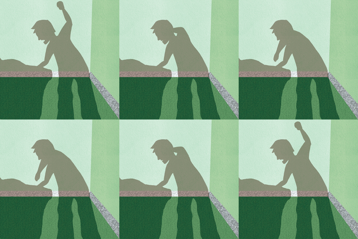
I thought for one of my pieces, I would take a look at a hard-hitting subject that has to be handled delicately. I looked at some GIF artists, such as Lilli Carré[4], and Guillaume Kirkdjan[5], and took some inspiration from their styles. I liked how they used texture and lighting to create mood, and I decided to try and use the light as a main part of my piece. I also used textures like carpet and cracked walls on an overlay layer to make my piece have added depth and tonal qualities. I made the characters in silhouette as if their shadows were being projected onto a wall, and then created a loop of someone or something being punched repeatedly. There isn't a description of what is being punched, so this could either be a piece about domestic violence or perhaps even anger issues. The fact that it isn't shown leaves it up to the eye of the beholder. I feel I did handle this subject matter delicately enough as to not offend people or alienate a potential client for this piece.

I wanted something completely different for my final editorial illustration. I decided to create an illustrated page for a recipe that could be included on a website or in a magazine. I was inspired by illustrator Ohn Mar Win[6] and all the artists on the page, 'They Draw and Cook'[7], to create a recipe card that would be attractive to people looking at it. I really wanted to make it look professional by adding different background textures, as well as having a running theme of colour.

Overall there are a lot of different routes to editorial illustration, some that are more traditional and others that are pioneering a whole new breed of illustrators. It's still a growing market, and as we move on more into a digital age, websites and online articles will naturally take precedence over the printed media with the ability to create money without anyone having to buy a physical copy through advertising space.


References -
[1] OuterEdit (2012) OuterEdit Collab 5 - Aude Van Ryn. [Online] Available at: https://vimeo.com/50470763 [Accessed 25th November 2015].
[2] Heart Artist's Agency. Aude Van Ryn Artist Portfolio. [Online] Available at: http://www.heartagency.com/artist/AudeVanRyn/gallery/1/image/3542 [Accessed 25th November 2015].
[3] BACKEMEYER, Sylvia (1998). Eric Fraser: Designer and Illustrator. Lund Humphries Publishers Ltd, London.
[4] Lilli Carré. MOVING DRAWINGS. [Online] Available at: http://lillicarre.tumblr.com/ [Accessed 26th November 2015].
[5] Guillaume Kirkdjan. Guillaume Kirkdjan - Animation. [Online] Available at: http://guillaumekurkdjian.com/ [Accessed 26th November 2015].
[6] Ohn Mar Win. Ohn Mar Win. [Online] Available at: http://ohnmarwin.com/ [Accessed 26th November 2015].
[7] They Draw and Cook. They Draw and Cook. [Online] Available at: http://www.theydrawandcook.com/ [Accessed 26th November 2015].

Thursday, 29 October 2015

Sara Fanelli

Sara Fanelli has a style that involves collage materials and very traditional mediums. This style is one that I would have said is completely opposite to mine, but I actually found myself enjoying the freedom and child-like methodology to her work.


This was my first trial at a Fanelli style image, and I was inspired by her book, 'Mythological Monsters of Ancient Greece'[1]. I tried to include her signature nose and mouth, and used hand written text instead of a font. This piece is also completely traditional, which is different for me as I'm usually quite digitally based, so that took me out of my comfort zone. As Fanelli said in an interview with Steven Heller, 'I definitely love the element of accident and surprise which is a gift of the process of making images, especially in a relatively old fashioned technique like collage. Cutting the wrong shape; spilling the ink; covering mistakes.'[2] I was very interested in the illustration Fanelli did for the creature Argus, as it had so many eyes. I wanted to try and interpret that.

I also took inspiration from her book, 'The Onion's Great Escape'[3], as there are a lot of stand-alone quotes that made you think in that book.

For the next three experiments, I used my preferred digital method to produce the images. I was interested in Sara Fanelli's love of fairy tales, as she illustrated 'Pinocchio'[4], but I wanted to do my own take on it, so I chose a nursery rhyme as my subject. I also got inspired by Fanelli's book, 'Dear Diary'[5], where there's an entry from Knife and Fork. She said in the interview with Steven Heller, ' I also enjoy giving life to inanimate objects very much.'[2] I got very inspired by the visuals and how the limbs were drawn. I used collage elements and drew on top in a very similar style to Fanelli, and also used hand written text which changes in style randomly like hers usually does.

I was inspired to do this piece after looking at Fanelli's book, 'First Flight'[6], where there were very interesting images of butterflies. This image is very much a replica of Fanelli's work rather than an inspired piece, as it looks almost exactly like one of her illustrations, but I was very interested in her methods and how she created the shapes and body. The body has interesting typography of random letters stuck one on top of another, with varying sizes and fonts. I used patterned paper to create the wings and drew the head very similarly to how Fanelli draws heads in general, with the semi-circle shape and the nose sticking out very pointed.

Fanelli has an affinity to dogs and wolves, and draws a lot of inspiration from them for her illustrations. She said in the interview with Steven Heller, 'The dog/wolf character is very organic and also adaptable. I love the way dogs expressions can sometimes be read as brilliantly enacted human emotions. I have always drawn dogs, but they change and grow.'[5] I wanted to create a scratchy dog illustration like hers after seeing her book, 'The Doggy Book'[7], as I really enjoyed the diversity of her illustrations and how some were completely finished whereas there were others that were very sketchy. I also added another quote inspired by, 'The Onion's Great Escape'[2], where it's quite a philosophical question that makes you think and has a lot of weight to the question. I used a digital technique for this image, but it could've been easily recreated if not better using traditional means.

After so many quite close recreations of Fanelli's work, I decided to create an extra illustration that is much more my style but influenced by her work. I decided to base it on the story of 'Pinocchio'[4], and found a quote from the book I really wanted to illustrate. I still kept the illustration as a flat background with the graph paper behind, and only added depth to the character which is a very Fanelli type of trait. I drew it in my traditional style, with ink washes and bold outlines, but I edited the image in photoshop to add the collage element to his shirt. I also used the hand drawn text for the quote, and feel it really set off the image. I do like the fact it's mostly black, white and green with just the colour coming from the collage element, and how it's much more muted than most of Fanelli's work. That is more of my style coming to the illustration.

Overall I have learned to loosen up studying Sara Fanelli's work, and have a new found respect for her style, which I didn't enjoy very much before this project. I feel like I could take some inspiration of her work into my future illustrations and be influenced by the sense of freedom associated to collage and mixed media.

References - 
[1] FANELLI, Sara (2006). Mythological Monsters of Ancient Greece. Walker Books Ltd, London.
[2] HELLER, Steven. Wolves, Logic and Happy Mistakes. [Online] Available from: http://www.hellerbooks.com/pdfs/varoom_03.pdf [Accessed: 5th November 2015].
[3] FANELLI, Sara (2012). The Onion's Great Escape. Phaidon Press, London.
[4] COLLODI, Carlo (1883), trans. ROSE, Emma (2009). Pinocchio. Walker Books Ltd, London.
[5] FANELLI, Sara (2001). Dear Diary. Walker Books Ltd, London.
[6] FANELLI, Sara (2002). First Flight. Jonathan Cape Ltd, London.
[7] FANELLI, Sara (1998). The Doggy Book. Egmont Books Ltd, London.

Thursday, 15 October 2015

Chris Ware

Chris Ware thinks of his comics as speaking a language, rather than a genre of illustration[1]. He has a very specific, technical style which is so different to my sketchy, loose way of drawing. This project was a challenge for me which I tried my best to overcome.

I titled this illustration, 'The Life of Bella', as it's a story about my dog and all the mischief she's caused. I based the room on my house at home, and used the different squares to show different times of her life, and this template is based on Chris Ware's strip 'Big Tex'. Ware was very influenced by an illustrator called Frank King when he produced imagery such as this, showing a time lapsed scene in different sections[2].

I used very muted colours for the majority of the image, trying to focus the scenes on Bella and the things she's interacting with. I did this by making the main focuses brighter, primary colours, as Ware seems to do a lot in his works. This was the first image I tried to do for this project and I think I learned my sketchy style didn't really fit in with his colouring and layout, so in my other three images I tried to be more technical with my drawing and create a more polished, straight laced outcome.


This was my second attempt at creating a Chris Ware-esque image. I wanted to show time passing, with only subtle differences to the scene. I used the same shading technique as last time, trying to keep it simple and almost a cell-shaded appearance. He says colour is very important to him, as it is used to connect themes and people, and also tries to use it as naturalistic as possible[3]. This is why I chose a lot of greens and browns for the background, as they are very natural colours and don't distract from the bright pink of the character's jumper.


Chris Ware deals with a lot of emotional subjects in his works, which he feels is like him having a very personal experience with his reader[3]. With some of his comic pages, he leaves them without colour[4] and gives them a lot of different avenues to go down, so the reader can follow lots of different story arcs and read the comic in their own way. I tried to replicate this with my 'I Need to Escape' comic, which tells the story of a woman wanting to run away from her problems and dealing with personal issues, and fantasizing about the different ways she could run away. He says his work is somewhat autobiographical, taking experiences of his own and making images out of them. This is my version of an autobiographical piece, as I have felt this way before with my anxiety disorder. 


This is my last Chris Ware style image. I tried to create something that was incredibly straight edged and technical, and included a building as well as the passing of time. I was inspired by his book, Building Stories[5].

I feel like I really focused on his drawing style in this image, rather than putting my own stamp onto it. It really made me understand a lot more the attention to detail he has, and the way he creates mood with the lighting and colours. I respect his way of working more having studied his style and although my style is completely different, I feel I've learned some tricks to take into my future illustrations.

References -
[1] Edbookfest (2013) 
Chris Ware Interviewed at the Edinburgh International Book Festival. Available at: https://www.youtube.com/watch?v=4CVyVvR1YEM (Accessed 15th October 2015).
[2] OLIVEROS, Chris (2000). Drawn & Quarterly (Volume 3).  Drawn and Quarterly. Montreal, Canada.
[3] FearNoArtChicago (2012) Graphic Novelist, Chris Ware. Available at: https://www.youtube.com/watch?v=W4MOYCvgEmw (Accessed 15th October 2015).
[4] WARE, Chris (2003). Quimby the Mouse (Acme Novelty Library). Fantagraphics Books.Seattle, US.
[5] WARE, Chris (2012). Building Stories. Box Pck Edition. Pantheon Books. New York, US.